Saturday, October 2, 2010

TRICKS OF THE TRADE: ALLUSION OR ILLUSION


If slight of hand is the magicians forte, then slight of imagination is the professional designer’s expertise. What distinguishes the so-called ‘do-it-yourself’ decorator from a real pro is basically the magic they create in sculpting and creating space. No mere pretty pink polka-dots on a wall, but perhaps a floating wall, one which seems to exist in space with no apparent support. Is this magic or professional know-how? It is both one and the same; it is an understanding of how a room can be made to look other than it is, and for a space to be constructed to look as though it’s imperfections were perfectly manicured.

To begin, the narrow passageway is oftentimes an easy problem to solve. The professional knows that by dropping the ceiling, the side walls “seem” to expand it’s breadth, thereby increasing the width of the space. Was the space really widened? Was the neighbor’s apartment encroached upon? Of course not. It is simply a trick of the trade. Another bit of magic in making a floor appear larger than it is, is by tiling or laying the floor on the diagonal, so that it appears that it opens up the space spreading off into some undetermined distance. Put a border around it, the magic is destroyed, the illusion cut short.

When visiting Malmaison outside of Paris last week, I noticed an abundance of antechambers, spaces designed to create the expectation of surprise and a breathing area, like a stop in music, where one waits in wonder as to what comes next. Often, these antechambers have dropped ceilings so as to create a sense of enclosure while simultaneously making the entering space feel even larger and more majestic. This sculpted drama is sensual in its appeal of the unknown. And then, when the individual passes into the major room, it is grander than thought. There is really a type of physics going on here, as one lessens the feel of one area, the conjoining area seems enlarged. Niches do a similar thing; they carve out space, yet make it look larger. They create diversity and a sculpted sense that something lies beyond and within.

Another bit of magic is that created by the half-wall. Instead of building all the way up to the ceiling, and closing off a space, a half or three-quarter wall is created to divide spaces, while maintaining an open, airy feeling. These partial walls, which may be made of glass block, cabinetry, sheet rock, sandblasted glass, metal, basically any material add interest and intrigue. It begs the question of what is beyond....and yet visually it is completely open. This too is magic, as the viewer must now postulate on what lies ahead. Mirrors create magic as well. Basically, they expand space in addition to reflecting light. So, for instance, poised in a narrow hallway, they open up that area at seminal junctures. Also, if cleverly placed, say diagonally across from a window, it opens up the view by reflecting it. In addition, if the wall colors surrounding the mirror are light, this brightness will add to the walls reflectivity. Putting mirrors on every wall, including the ceiling will NOT enhance the room, but make it look ridiculous. A true professional knows how to and how not to use mirrors to their advantage.

As to the magic behind furniture placement, common sense dictates. Too many do-it-yourselfer’s align pieces with the direction of the room, so that a long couch will sit against a long wall, emphasizing the length of the room, instead along its horizontality. Instead, furniture should be placed against the grain, with the couch/s adjacent to the long wall, creating a more harmonious, balanced effect.

Pocket doors create magic by disappearing into walls and economizing space. They are also very elegant, when outfitted with beautiful hardware. Another trick behind enlarging space is to lay wall-to-wall carpeting down throughout the major connected spaces. This makes the room feel larger and more balanced. In rooms, like the kitchen, employing a soffit, which adds light in a consistent, yet focused stream, gives the illusion of light all around. Like cove lighting, it enlightens and enhances the area.

In terms of drapery, it is typical to assume that they will cover the view. While this may very well be the case, if it is done correctly, they will not. Instead, side panels can actually enhance the view by framing it, as opposed to covering the opening. It may not be obvious to some, but built in cabinetry, when designed correctly, will enlarge a space as well. It becomes recessive and disguised as part of the wall, while serving a major storage purpose.

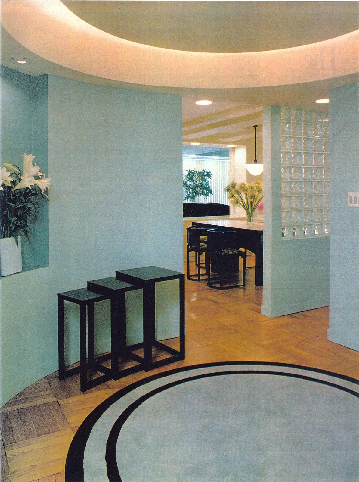
And, finally, the creation of an entry foyer is perhaps the single most aspect of designer magic. By carving out a space, albeit small, it serves as a preface of what is to come. Again, it gives the illusion of grandeur beyond. So as not to enter directly into the living room, it is a transition area for circulation and surprise. What exactly lies beyond this curved wall, or veiled panel?

These are some of the slights of hand, flights of imagination that the professional designer and architect conjure up to create the magic of space.

Sunday, September 5, 2010

THE UPSIDE DOWN ECONOMY


THE UPSIDE OF A DOWN ECONOMY:
WHY RENOVATING, DECORATING, AND BUILDING MAKE SENSE NOW

It’s an Upside Down Economy; so, why would it make sense for the consumer to spend dollars on renovating, decorating, or building now? In addressing this question to a residential real estate broker, architect, and contractor, I received some very interesting, yet rational answers. When dollars are most precious, does it make sense to spend? Is there an upside, a positive, if you will, to actually renovate now? And, if so, why is it a really intelligent move. The answers are varied and numerous.

To enumerate a few incentives to renovate are the following: labor costs are less expensive, the consumer gets better prices on goods and services, the trades are available, ready, and willing to start work, remodeling and building are executed at a faster pace due to availability of sub-contractors, more attention is paid to the client, more attention is paid to detail with work executed in a more meticulous manner, the consumer gets more for their money because of more rigorous bidding, and the interest rates are at a low point.

William Vilkelis of Barak notes that there are a number of reasons why now is a good time for the consumer to consider buying and renovating. “With historically low interest rates and the availability of tax credits, the market is stable because lenders have tightened their lending requirements and there is the perception that ‘value’ exists in the market right now.” Vilkelis says that in “just a little over six months, the market went from a buyer’s market to one of equilibrium. “ That is, it is now a well-balanced industry that sees buyers and sellers on relatively equal footing. For this Barak broker, for instance, inventory is moving quickly on the Upper West Side, where he can’t get a buyer in quickly enough to see a property because of an already written commitment. Unlike the previous markets which saw a sharp rise in seller’s prices, this one is more stabilized. Buyers are seeing more reasonable prices; that is, they see value in the marketplace and are therefore purchasing fairly priced properties."

For the contractor, similar observations are made. Jeff Streich, of Prime Renovations, Inc. believes that this economy “presents an opportunity to work with the best available labor, which is now ready and willing.” From his perspective, “with a more relaxed economy, building is performed at the highest level of standards with an eye on detail.” In addition, the industry has provided various building materials and energy rebates, along with various tax credits. Streich notes that “Renovating saves the cost of selling and moving. “ He encourages his clients to invest in their current homes or build anew for increased property value.

And, for the architect and designer, this upside down economy actually provides an excellent venue for the client to renovate and redecorate. First and foremost, the best of the best in terms of labor and materials is available. The service element is excellent; vendors are motivated to supply the architect and designer with materials almost on demand. As David Estreich, of David Estreich, Architects notes, “This is a superb time for the consumer to renovate; they get lots of attention from vendors, and the best available pricing from the contractors.” From his perspective, the three most valuable investments for the consumer now are: the kitchen, the bath, and the master plan. Of course, kitchens and baths, while the most expensive rooms in the house to renovate are also the most remunerative investment. They add an enormous value to the apartment or house. A more discrete and less obvious investment, which in theory is the most valuable, is a concept, a Master Plan. Estreich believes that this two-dimensional layout is extremely important to the success of the flow of the house. Before anyone invests in beautiful furniture, they need to invest in a developed scheme, one in which all the pieces fit perfectly in place. He says that “once you have a plan, you can then implement it one piece at a time.” “Invest in a plan, and you invest in the basic foundation of your home, one that will last forever.”

For these three professionals, this economy has an upside. The positives preside for the consumer, as they enable the buyer to get both excellent service and great value.

Thursday, July 8, 2010

Attention to Detail: God is in the Details


As Ludwig Mies Van der Rohe exclaimed “God is in the details.” The famous architect knew that what separates the sublime from the mundane is the attention to detail that an artisan expresses in their work. It is refinement of technique, if you will, a stylistic turn of the hand that somehow transcends the mediocre, bringing the work into the realm of the ineffable. As Nelson Algren, the writer says, “it’s all in the wrist.” Of course, we are not talking billiards here, but about the loving care and eye that the master craftsperson creates, when sculpting his work of art, whether that be a painting, a building, or an interior.

Attention to detail goes hand-in-hand with quality workmanship. It is a creative process in two ways: one is the evolvement of a work of art from its inception in the artist’s hands, the other is where the artist leaves off and the work becomes a living entity unto itself. That is, the work that is built, from this creative process, now relates to the world at large, its form having transcended the admixture of material and inspiration. What is the outcome? Sometimes something so beautiful, it is inexpressible; sometimes something so witty, that it transcends humor, sometimes something so subtle, that its refined sensibility, its synesthetic appeal to all the senses is, just “is.”

As an interior designer, attention to detail is expressed in many different ways. Perhaps, it is the result of the unexpected: using materials known to function for one purpose, and used as another. For instance, one generally doesn’t see drapery cornices composed of metal tiles. Doing so, not only greets the viewer as a surprise, it evokes interest and an element of perhaps intelligence in its relationship to its surrounding environment. Another such detail, used mainly in architecture, is the reveal. It is a subtle groove, a void, between elements, whether that be between the floor and the wall perpendicular to it, giving the wall an elevated feeling , or a carving out of part of the baseboard, giving it a lighter, more sculpted look. Reveals are more commonly seen in door frames or cabinetry, where, in effect, it says to the viewer, that it is separating one architectural element from another - in this case, the door from the frame, or one piece of wood from another.

Attention to detail encompasses the materials and finishes used to create a piece of furniture or structure. Something as common as a doorknob can become a work of art if the one chosen is of superior quality and design. For instance, a hand hammered knob by Butler, which takes many hours of careful labor to create is not the same as the typical Baldwin knob produced on an assembly line. A desk hand-made of straw, piece by piece, hour after hour, with a great labor of love, is a tour de force. Costly, yes; worth it, definitely. It sublimely surpasses the ‘sameness’ of most furniture. Other elements of attention to detail like using nail heads on a sofa delineate and distinguish these differences as well. As small an element as the cord or trim on a chair or pillow can speak volumes in separating it from the mass produced. Parchment, woven meshed metals, shagreen, cashmere, cerused woods are all materials and techniques which are different and unusual. Even employing a striae wall technique can alter the appearance of a wall.

Perhaps it is the sheer element of the unexpected, such as a prison-like stainless steel water closet in a very high end bathroom that evokes that illusion. Or, the ironic composition of putting a leather wall tile in a bathroom contiguously poised next to irregularly Erin Adams’ hand-cut tortoise shell tiles, installed bit by bit, that creates a beautiful juxtaposition. On the humorous side, it may be a kitchen bar faucet that looks like a vodka bottle. Or a Jean Cocteau illustration drawn directly upon a wall. Kohler’s new HatBox water closet is a humorous expression of the common day toilet. While perfectly functional and exquisitely designed to look like a hat box , it is, in the end, just a toilet. It’s serendipitous combination of form and function transcends the usual.

And, then, there are the master craftsman, who manifest these masterpieces, who have the vision to create and recreate originals in their own mind’s eye. Artisans like Jean-Paul Viollet’s Atelier sculpt pieces that combine precious and unusual materials into aesthetic and functional forms of furniture. For example, he regularly uses straw, shagreen, horn, and exotic woods like amboyna, with mother of pearl inlay, materials and finishes not commonly seen everyday. Within the fabric arena, one finds Gretchen Bellinger’s pearl and diamond studded silks that are so subtlety woven that, though sounding over the top, are subtle productions of woven goods rendered absolutely gorgeous. Carolyn Ray’s wallpapers are so ingenious and witty; they combine historical and humorous images, like that of a collage, to create interestingly patterned walls. With leather, we have fabricators such as Dualoy, who combine colors, techniques, and designs, making their goods look rich, luxurious, different, and clever. And, lastly, there is ornamental plasterwork, which separates the ordinary from the unusual. Here, the master craftsman like Balmer carve and sculpt beautiful images, whether modern or traditional, for the ceiling, walls, or cabinetry. They add depth, interest, and fascination, when looked upon.

What distinguishes the good from the great, the mundane from the sublime, the slapstick from the witty: it’s all, as MVR says, “Attention to Detail.”

Wednesday, May 5, 2010

LIVING WITH ART


LIVING WITH ART by Gail Green, Green & Company, Interior Designers

More than ever, the design and decoration of a space play a significant role in the successful display of art. The landscape against which the art or sculpture sits becomes its surrounding background, highlighting the work like a secondary frame. This framing device- be it a wall, a visual opening, a table, or the floor - becomes an essential component to the artistic expression. The message is the same: it is about how space relates to art and how both compliment one another, emphasizing each other’s best lights.

Although most art collectors, connoisseurs disclaim the importance of decoration, the eye knows differently. It senses disproportion, conflict of space, adversity of color. That disharmony pits the art against its environment, rather than working with it. In many ways, this is comparable to the painter choosing to frame the art himself as – frame and art - bear a direct relationship to one another.

Having accepted the importance of design to art, the owner can position their art in numerous ways: on tables, on floors, on walls, in between walls. In addition, sometimes a painting is created directly onto the wall itself so that the wall becomes integral to the art. As art collector Paul Frankel notes about his Sol Lewitt that sits permanently on his dining room wall, art becomes “a transcendental experience enhancing one’s personal environment on an intellectual as well as visual level. It is a perfect example of where art, design, and decoration converge.”

Art consultant and appraiser Beverly Jacoby sheds some professional light on the subject. She maintains, “Great art and great design create an ideal environment for living and working. The design and architectural plan exert a decisive influence on the art choice, particularly regarding size, placement, proportion, color, and choice of medium. For a client with a panoramic window wall with southern exposure I would recommend sculpture, works of art, painting, and perhaps a multi-media piece. Works on paper and new media like digital should be placed in low light areas, such as in a library, gallery or hallway.”

Therefore, for a work of art to be successfully illuminated, it needs to bear a direct and significant relationship to its context.

Saturday, March 13, 2010

VALUE,VALUE,VALUE: 21st Century Accent on Design


VALUE, VALUE, VALUE: 21ST Century Accent on Design

With the current economic downturn, homeowner’s are not only seeking the ‘right’ location, they are seeking VALUE. Value matters because it insures security for the future, an investment that will increase its inherent worth. Homeowners want to invest in improvements that last. In addition, these home renovations – whether architectural or decorative – are a “return to basics;” that is, a return to core values, items that show a useful purpose and are not mere flourishes. Basics parley into quality investments where “less is more.”
In terms of Comfort, one needs to start with warm, inviting, casual environments. Neutral fabrics and colors for decorating the inside and solid building materials for constructing the exterior are all important. Not commercial grade fabrics, but good quality, long-lasting classic fabrics are essential to both the warmth and comfort of the family, who is now spending a lot more time at home. Soft fabrics, quiet fabrics (with little or less pronounced patterns) are timeless and best. For instance, velvets, smooth cottons, sueded leathers with tone on tone patterns create these more subdued images. Not slick, but soft; not loud, but subtle – these are the hallmarks of today’s style. In addition, more inviting furniture arrangements require an ambiance that allows for better communication, bringing people together.
Three aspects of home / apartment building assure good value: Kitchen renovations, bath renovations, and an excellent master plan. The first two working projects are obvious. Customers look at the state of the kitchen and bath when making explicit value judgments about home investments. David Estreich of Eastland Kitchen and Bath Design says, “What is less apparent, but more important, than the physical alterations to the kitchen or bath, is actually how a space “Feels.” He continues, “It is an implicit understanding that before a space can ‘look attractive, it must evoke a good feeling. It is not something seen; it is something felt. Therefore, one needs to get a good feeling.” The space flows, properly. Like a bespoke suit, it feels as though it was meant to be, falling into its proper place, fitting just right. No bias pulls, just soft and easy.
The Secret: An excellent Master Plan. The plan sets the pace, the pace sets the place. Like a puzzle, the pieces fit perfectly together. This is true Value. All great designers and architects know that to begin with the general, with a coherent concept is key to great architecture. This notion has fallen from design graces. We seem to think that pretty backgrounds, fancy furniture, fussy finishes will increase value. They do, but only after its foundations are set firmly in place. We value the explicit, where trends dictate perpetual change. But real inherent value lies in the subtle, quiet, classic and classy choices. When one enters a house or apartment, it is the entry which evokes a sensibility that all is well and in place. The rooms effortlessly flow from one to another. “Value” is knowing that your investment will last, that it will pass from one generation to another, if so desired. Quality generally infers something more expensive, but it also means a product that will be longer lasting, an investment that is not ‘spur of the moment’. It means thinking before buying, knowing that less is more and investing in a piece of furniture that will not depreciate the next month, but perhaps perpetuate. Well-upholstered pieces that will endure and solid finishes that are not flashy and cheap are those that will stand the test of time and endure.
Renovations need to be utilitarian, quality-conscious, and comforting, as more households spend more and more time at home. Along with kitchen and bath renovations, quality merchandise creating comfort and ease, the mark of design success is a great plan. VALUE, VALUE, VALUE is the keystone of today’s building marketplace.

Wednesday, January 13, 2010

LOOKING UP


LOOKING UP: THE LOST ART OF CEILING DECORATION

Angelo Dongia, the famous interior designer, referred to the ceiling as the most ignored, but interesting, of the six planes. Fortunately, it hasn’t always been that way. Michelangelo and his patrons didn’t exactly perceive it as such. All the great architects through centuries past have ‘looked up’ and found an interesting surface to adorn. It seems that with the advent of the hi-rise apartment and its lowered top, the ceiling has seen better days. Not to despair. With all of the other five surfaces well explored, the design/decoration of the ceiling has much left to offer the design professional and enthusiast.

There are several options in considering the design and decoration of this sixth surface. It can be painted, carved, plastered, upholstered, covered with glass, covered with metal, wallpapered, tiles, beamed, mirrored, leathered, trussed, and any combination thereof. The purpose behind its decoration is both aesthetic and/or functional. Thus, aesthetically it can be pleasing to the eye, while functionally, it can house lighting, define space, and carve out great sculptural shapes (i.e. skylights, domes, etc). For those optimistic, spiritually minded, the ceiling is a refuge of delight that both enhances and embraces the space at large. Let us consider some of these applications to see how successfully the ceiling can accomplish its art.

Perhaps the most obvious application is that of painting the ceiling. But even within this genre, there exists a multitude of choices. Certainly, the early painters like Michelangelo used the ceiling to express the zeitgeist, the spirit of the times incorporating religious and political motifs into majestic murals. But apart from these magnanimous pontifications, which predominated ceiling painting up until the 18th Century, the ceiling has recently been painted in a number of ways. Faux paint such as striae, trompe l’oeil, abstract motifs, silver or gold leafing, and just plain paint (in perhaps a different color) represent just a sampling.

Another early technique, which has survived the centuries, but not now as predominant, is that of the plastered ceiling. Very common in castles, estates, and homes for the wealthy is the highly decorative, plaster pattern. Seen mostly in university clubs and bastions of elitism, plasterwork is expensive and conveys a message of importance to the room. Allied to this technique, is the application of woodwork, that sometimes looks like plaster but is actually wood painted over. In its more obvious rendition, is the wood coffer, creating patterns of three-dimensional relief upon the ceiling. This is a more masculine, library look found for the most part in studies, dens, and libraries.

More recently, the ceiling has been adorned with wallpaper or fabric (which includes leather). Not only wise for sound insulation, this use can provide an interesting, warmer aspect to the environment. Some designers even tent the fabric, gathering it at the top as to suggest an Eastern, oriental feel. Mirrors have been used on the ceiling as well, but mostly in bachelor pads and discos. Its counterpart, glass is used in more functional ways, admitting light and creating a halo-like aura. Skylights, as they are commonly referred to, enlighten and add to the breath of the room in which they are situated.

The use of stone or ceramic tiles on the ceiling has also become rather common. Here, we find it most regularly used in bathrooms and spas, where the stone can accommodate the moisture build-up. It can be most pleasing to the eye, by creating a continuous look throughout on all six walls. Metal, whether in tile or sheet form, is also used on the ceiling. This material can be painted or lacquered to protect the finish, or left raw to oxidize, depending on the desired look. And even, shells, leaves, horn, and bits and pieces of different materials together have appeared on the ceiling to create and express the owner’s personality.

On the more architectural side of ceiling design is the carved dome, dropped surface, beamed structure, and opened space all serving a specific yet aesthetic function. For instance, by carving out a section of the ceiling in the shape of a circle, square, oval, etc., the designer actually defines the space below. As in the picture illustrated, the sculpted ceiling gives that designated space definition; it makes it special. It lets you know that it is a space unto itself; it’s not just walk-through circulation. The modern beamed ceiling accomplishes the same thing; only it’s more architectural in feeling. It draws lines in the air, overhead, telling you where and what your limits are spatially. In addition, by creating coves or dropped beams at the ceiling, lighting can be housed and wires concealed. Cove lighting combined with some ceiling sculpture can create very interesting, atmospheric effects. Functionally, through the use of dropped soffits and beams, the ceiling can house all types of electrical and audio wiring, air conditioning ducts, vents, recessed down lights, and speakers to name a few.

The “Ceiling” has resurfaced. In recognizing both its aesthetic and functional capabilities, the designer now sees the potential of this forgotten surface and the advantages of “Looking Up.”

www.GreenandCompanyDesign.com;

Thursday, December 3, 2009

MAKING A GRAND ENTRANCE

MAKING GRAND ENTRANCES: THE FOYER

More important than any other space in the home is the Foyer. This oftentimes-overlooked area sets the tone and feeling of the entire home. It is both the first and last impression the homeowner has of his habitation. And, it is here where one is made to feel either welcomed or disoriented, depending on the feeling the foyer evokes. It is the prelude for what is to come.

Whether small or large, foyers are grand. They express largesse of space from which all the other rooms in the home radiate. The importance of the foyer can be suggested in several ways. Architecturally, the designer can carve out a separate space from the nondescript assigned closet, entry area. Ceilings can be dropped or raised or both. Lighting can be installed, cove or decorative, giving a special aura. Walls can be moved, shaped, carved to create circular, square, or any shaped spaces. Niches can be added to enhance the foyer’s suggestive aspects: a hidden vase, a highlighted picture, a surprise curio. Floor patterns move and define the area, whatever the material may be.

In addition, the use of differing materials also helps define the foyer. Glass block, while suggestive of the space beyond, defines and lets the light through. It opens up the space as a whole. Sandblasted glass, metals, and other hard materials can also accomplish similar purposes architecturally.

Decoratively, the foyer can be distinguished in many other ways. For instance, an area rug shaped to the contours of the entry can subtly emphasize the expressed area. The placement of mirror or mirrors in the entry open up the space and also allow the visitor, whether coming or going, a graceful peek at one’s appearance. They also provide, if correctly placed, a sneak preview of what is beyond. In addition, mirrors tend to add light in its reflection of the existing light. Another important decorative element defining the foyer is paint. Here, one can become more creative, as the space tends to be more unusual and sculptural in nature. A bold color accented by more subtler tones of the same can enhance the foyer greatly and give hints of what is to come color-wise throughout the rest of the home. In addition, decorative paint techniques can be successfully employed here without having to be experimented or used elsewhere. Stucco, trompe l’oeil, cross-hatching are typical painting devices. Wallpaper and upholstered walls accomplish the same but tend to evoke different kinds of feelings. Walls covered in fabric create a warmer, dressier environment: papered walls, a more traditional one.

The foyer can also become well defined through the use of furniture. Here, the unusual antique can be magnificently highlighted. Or, a great vase with towering flowers can welcome the visitor that in another part of the house might look awkward. A small cafĂ© table with side chairs, nesting tables, small lamps, are all different kinds of pieces successfully used here. It is in the foyer where the bench is best used, whether one is putting on one’s shoes, waiting, resting, or just pondering. Lastly, the eponymous “entry table” makes it’s splash by its defining and aesthetic grandeur.

Paintings, sculpture, and other artwork attain especial significance in the foyer. If placed on ledges, in niches, within frames of walls, the singular piece is highlighted. In addition, one element of the foyer that is usually overlooked is the entry door. But it is here that one can be really creative. On the interior of the door, the face material can be changed to wood, metal, or even glass. The door hardware can be altered to be consistent with the hardware within. Mirrors can be affixed to enlarge the space. Unusual windows within the door structure can be created. If it is a house, the entry door can be made wider or narrower, and can encapsulate other materials such as cast glass side panels, over panels, and transoms of all shapes and sizes. And, finally, one finds here the foyer’s most traditional element, the staircase. Whether metal, wood, wall, or glass, its import is significant, in making the biggest statement.

The Foyer orchestrates the tone and feeling of the home, while setting its functional and aesthetic aspects. It is the creator and maker of all Grand Entrances.